What is UX Design?
UX, or user experience, is just what it sounds like – the experience one has interacting with an object. UX principles ensure that a design is functional and purpose driven, giving users what they desire out of an interaction without encountering any unnecessary, distractions, obstructions, or difficulties in task completion. Good UX leads to a happy user. Bad UX leads to a frustrated user.
UX should be the guiding principle behind the design process for all things, not just emails, websites, and applications. Think of an emergency stair case exit. The best UX for someone using an emergency stair case exit begins with the stair case being easy to find in the event of an emergency, followed by being well lit, having hand rails, and wide enough to accommodate a large group of individuals of different fitness levels.
Bad UX would be a stair case that is difficult to access, doesn’t have enough light, and is too narrow to accommodate an emergency flow of people.
UX is simply usability.
When it comes to developing digital assets, UX and its purpose get lost. Great design isn’t always user friendly, but user friendly design is always great. Going back to the emergency staircase exit, most signs are bold, full of contrast, and large enough to see from a distance. This is a great example of a simple emergency exit that just about everyone would understand.


Now, look at this one. It’s still a functional and usable emergency exit, but may not be as easily digested in times of emergency. Or, perhaps, someone may use the exit outside of an emergency, accidentally tripping a fire alarm.

However, maybe this exit works for a segmented audience. Or, maybe the designer and safety manager had limited space to put up signs and this accomplished the goal best given those constraints.
As a designer and/or marketer, you’re always working with limitations. UX thinks about how to take advantage of the limitations with respect to the audience.
UX Design Meets Email Design
Limited real estate, the necessity of designing for multiple device sizes, and shorter customer attention spans make email the ultimate challenge for designers. Since email marketing is a ROI superstar, the pressure is always on to create emails that convert and delight customers. Designers usually opt for a more visual approach to email marketing while copywriters and information architects like text. The truth is, both options work so as long as the fundamental principles of UX design are met.
What are principles? The answers will vary depending on who you ask. However, you can never go wrong with these 7 principles.
1. Designed with the user in mind.
2. Designed within the context of the users.
3. Colors are easy to digest.
4. Text is well structured.
5. Simplicity-Not Minimalist.
7. Playful and fun.
8. Provides a clear path to the end goal.
Now, let’s take a look at how these principles apply to email design.
Designed with the User in Mind
Designing with the user in mind begins with identifying the potential scenarios that will happen once you click send on the email campaign.
The most practical advice for user design is to design emails with mobile in mind. Just over 50% of emails are read on mobile devices, but not all email marketing has caught up with this proven statistic. In 2005, the estimated time to read an email was 15 to 20 seconds. As mobile devices came into the fray, the number kept dropping. Email usage statistics from 2015 show that an email opened on a mobile device is read for a whopping 8 to 10 seconds.
Yikes.
Part of the reason for this drop in the number is the lack of mobile design considerations among email marketers. What happens when you open an email clearly not designed for a mobile device? You do your best to read some of the content, become frustrated, and hit delete.
Imagine opening up a newsletter that looked like this on your mobile device.
This is not a useable mobile email, nor it is delightful.There would be way too much text and content on a potentially small screen. The CTA is almost as wide as two information columns. Something like this is bound to get closed just as soon as its opened.
Now, compare that with Domino's mobile application:
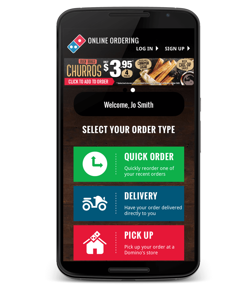
Clearly, this is designed with the user in mind. Though there are plenty of considerations when designing with the user in mind, mobile experiences should be top priority for email marketers. Get in the habit of asking yourself, “What does the user want and what does the user need to accomplish the task?” and you will begin to alter your entire approach to designing emails for marketing campaigns.
Designed Within the Context of Users
Plain and simple, email marketers to understand their customers better today than they did yesterday. Without knowledge of what customers are expecting from an email campaign, email marketers are designing in the dark. While the sales funnel model remains static, customers tastes and preferences tend to evolve over time, especially when new and better technology comes out that enhances the media consumption experiences. If you want to keep nurturing leads through your funnel, it’s important to have a grasp on what will delight those leads.
This is why segmenting your email lists is so important. With each list, you can create an entirely new variation of an email campaign. If you’ve identified the path leads take in the conversion process, you can now contact those leads with three different emails.
The different stages of a sales funnel require emails to offer different designs (usually small variations) and different information (usually much different from email to email). If you can understand a customer journey, you can understand how to design for different email subscribers.
Colors Are Easy to Digest
As an email marketer, you’re a little bit of everything: storyteller, designer, information architect, and creative talent. The end goal is to give your subscribers some sort of structure the leads them on a certain information path. Colors and text are the foundation of structure and the stars of your information highway.
And you don’t have to be a designer or copywriter to implement UX principles.
A limited color palette is always better than a color free for all. Limited palettes don’t need to be limited in the number of colors, just limited in the sense that all the colors serve an information design purpose. Color psychology for marketing is a growing field, especially considering each new wave of technology brings in different screen resolutions and color displays.
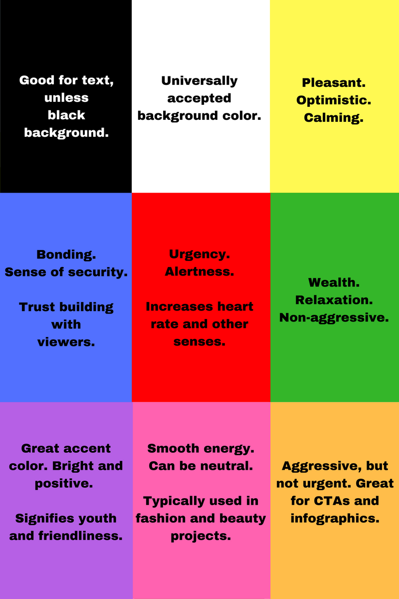
Using the basics of color psychology, pick a palette and stick to it. For example, if you are creating a spring sale email marketing campaign, use these colors, making most of the text black.

Now, let’s say you are sending out an email and want to convey a sense of urgency to the reader. Something with orange for the CTAs and blue and green to convey trust will help increase your landing page conversion. A palette like this can work well in such a scenario.

Regardless of what color palette you pick, try to make sure that each color has an information purpose, not just a design purpose.
Text is Well Structured
Realistically, a subscriber who opens an email will spend between 8 and 20 seconds reading or skimming through the email. While the importance of writing awesome email subject lines has been well documented, the structure of the body of the email text is often overlooked. Because so much of digital communication is visual, our eyes begin to start forming a “picture” of the text. If the opening lines aren’t crafted like a piece of art, the reader will likely close the email before getting to the end.
What this really means is that readers do not want to feel overwhelmed when they open the email. If they open the email and there appears to be too much text, or the text is too scattered, or there are no breaks, the reader will not want to read the email. Would you?
Let’s take a look at some examples, starting with PayPal, who consistently produce great UX principled emails.
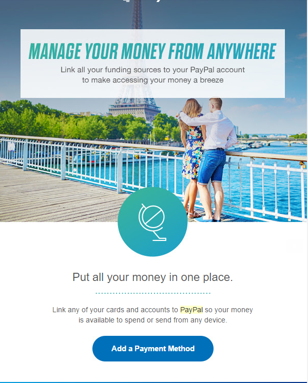
When I open this on my smartphone or desktop, I’m pleased. The first chunk of text is a bold header followed by a small break with some darker colored text. After the hero image comes a smaller header, another break, a bit more text, and an appropriate sized CTA. This is very easy to digest.
Now, compare that PayPal email to this:
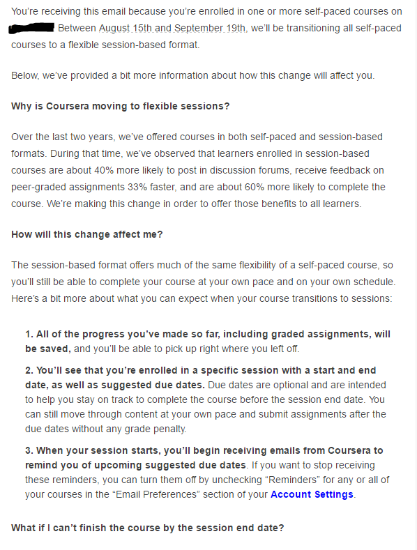
Is this email easy to digest? Does it have an appealing structure? No on both accounts.
When I opened this on my smartphone, I did a very quick skim of the text and quickly deleted the email. The length of the email is overwhelming and reads more like a FAQ or terms of agreement web page than email communication.
A reader evaluates an email for a short period of time. A combination of structure, color, and text appeal all drastically increase the likelihood that the reader will get to the end.
Simplicity – Not Minimalist
Minimalism works because it results in design and form that are very appealing to email readers. Minimalist design uses a few colors, lots of white space, and very little text in order to convey information.
While minimalism is definitely “in,” it’s not always the best way to provide readers with information. Many times, minimalist design elements rely on non-verbal communication like icons, emoticons, and buttons to bring the reader through a series of checkpoints on the information highway. These design elements can look great, but the UX approach doesn’t care as much about what looks great. Instead, the UX approach seeks to answer “What works best for the user?”
That’s why the basis of all UX design comes down to simplicity. Simplicity means using the fewest elements – colors, words, forms, and anything else on page – to provide the user with the experience they desire. However, in some cases, simplicity may require quite a few elements.
Simplicity is challenged when you have very little real estate to work with, like when building an optimized opt-in form.
Check out this opt-in form from Opt-In Monster.
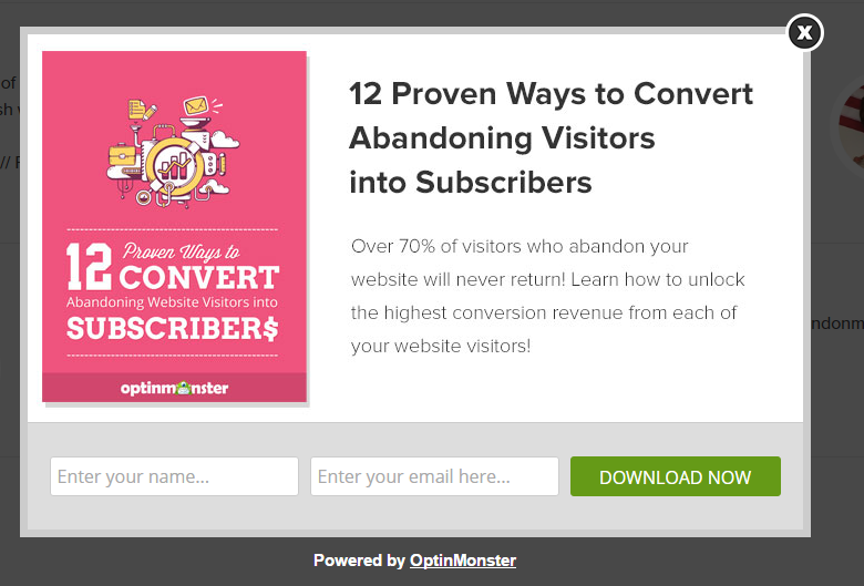
Now, the minimalist approach would have probably just been some text, or an image, followed by a “Download Now” CTA. However, this opt-in form features a colorful image, left-to-right content skimming, lots of white space, and a chance to download the content after entering only the name and email.
Had the designer just put one element and a CTA, the reader may be asking too many questions at once, lowering the opt-in success rate. Instead, the designer took a simple approach, which, although may require a few more seconds of reading, is less distracting than opting-in, being brought to gated content, and, in some cases, having to enter more information.
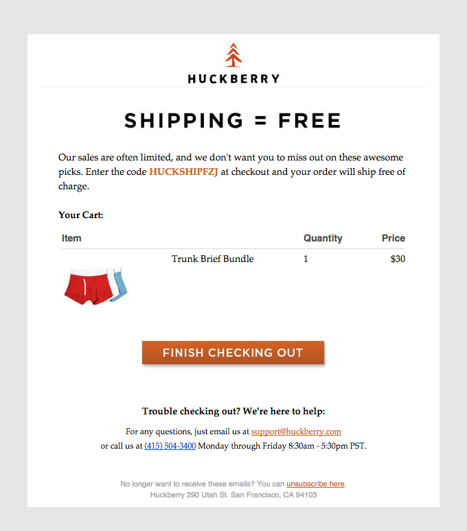
This is a great example of a simple cart recovery email that also happens to be pretty minimalist. When the subscriber opens the email, the first thing he will be greeted with is an offer for free shipping. And, it’s also easy to get back to his cart.
Simplicity, even when it seems complex, always wins over the uncessary.
Playful and Fun
Playful and fun is my favorite, for no other reason other than playful + fun = memorable.
This email from Kate Spade sure does the trick.
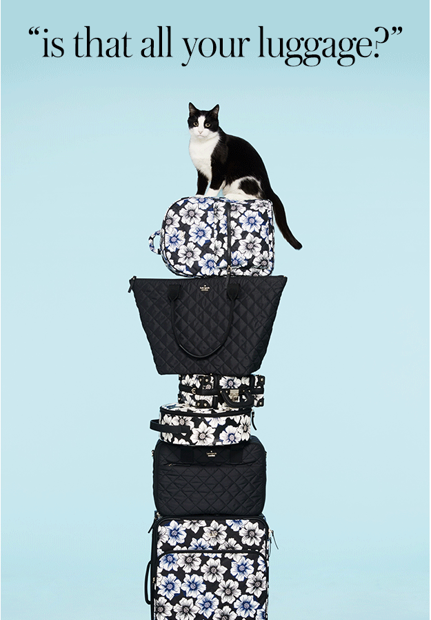
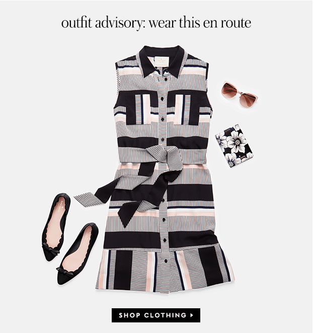
This is not only a fun email, but one that is very useable. After each image, there is a call-to-action button that serves a function of taking the reader to the appropriate store.
This is a great example of something fun and user first oriented.
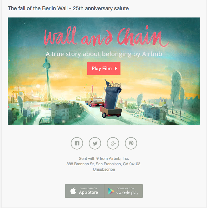
Most emails that contain video don’t go the extra mile in creating an interesting visual to appeal to readers to actually press play. This email from Airbnb not only goes the extra mile, it offers readers a way to immediately watch the video.
A Clear Path to the End Goal
And, we’ve come to the end of our journey.
Hopefully, your email subscribers have, too.
What’s the purpose of the email for the user? Ultimately, it’s to engage with the page, to engage with the next page, followed by the next page. In that sense, each email is a micro-journey. Make it easy for them to achieve the desired goal. If that goal is to get the users to submit information so they can download gated content, make a clear path for the users to complete the action. If the goal of the email is simply to inform the users about a particular change, evaluate the best way to make potentially longer texts less overwhelming.
Put on Your UX Design Thinking Hat
Pouring resources into design, writing, and segmentation means very little if the user doesn’t consider it useable.
When creating your next email marketing campaign, think less of what is most beneficial to your organization and more of what is beneficial for the user. If you build your campaigns around this principle, you’ll delight yourself and all of your subscribers.
[Tweet “Delight Your Subscribers Through UX Design”]