We all want more email subscribers. One of the easiest ways to get them is to start at the very beginning – the opt-in form. If you can make even a few positive tweaks to the beginning of your opt-in form process, the results will follow through all the way to the end of the year and improve your email ROI.
To help you get more opt-ins, we’ve combed the web to find all the case studies and best practices for opt-in forms we could. The roster of opt-in form best practices below is that roundup. All data based, split-tested, and ready to go.
Of course, every time we mention best practices, I have to mention that one company’s best practice is not necessarily your own best practice. You’ve got to test. But these should give you some very good testing ideas, and point you toward which test will make the biggest difference in your opt-in form.
1) Give them a reason
The best way to boost opt-in rates? It’s to offer an incentive. For B2Bers, that’s usually a free report, or maybe access to a white paper or a video series. Online tools are good alternatives too. So are quizzes.
In a survey of how marketers (mostly B2B marketers) are growing their email lists, two tactics rose above the rest:
- Website access
- Content downloads
Content downloads include the white papers, free reports and other assets. Website access is a different thing. Ascend2 defines it as “requiring registration to gain access to private or restricted areas within a website”. Because we’re focused on opt-in forms for this post, we’ll lean a bit more toward content downloads, but both of these tactics share a larger strategy: Get the address in exchange for extra-good content, a key practice used in matching your B2B content with your sales funnel.
That’s the best way to boost the conversion rate for your opt-in forms. Offer unusually good content. For an example, you want to do this:

Not this:
2) Don’t ask for too much on your opt-in form
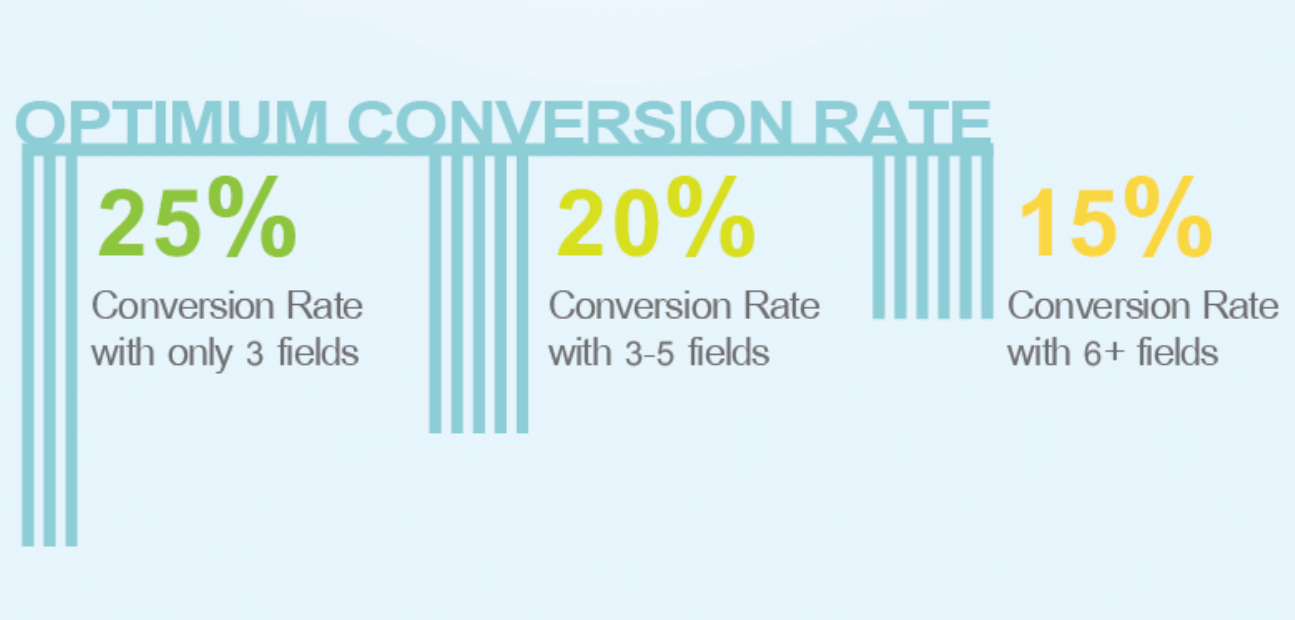
You’ve probably heard that adding more fields to an opt-in form will suppresses opt-ins. How many fields is the ideal number? Research shows the optimum number of fields on an opt-in form is between 3-5. Conversion rates tend to hover around 25% when they are a three fields and dip to 20% when four or five fields are added, according to research from Quick Sprout.
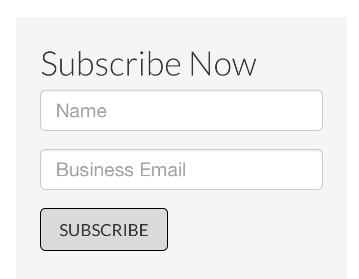
Which piece of information should you ask for? After an email address, the most common piece of information to ask for is someone’s first name. Having a first name allows you to put it into subject lines, which has been shown to increase email open rates. It also means you can put their name into the body of the email as a salutation. This is a nice thing to be able to do and most email service providers – Pinpointe included – make it easy to add a person’s name to your emails.
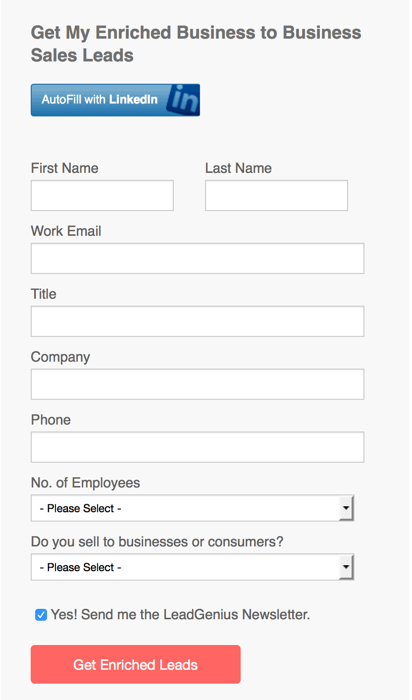
Because we’re in B2B, many of us are going to want more information than just the name. This is when email opt-in practices and lead generation fuse together… for the most email opt-ins, you want to keep the form in email as short as possible. But if you’re hungry for leads and want to give your sales team good quality leads, you’ll want to use an opt-in form that looks more like this:
How you choose to resolve this completely depends on what your business goals are. Maybe you just want to build your list super-fast, and so you’ll take just the email address and worry about getting more information later. Or maybe you’ll want to get even more information that the long form above asks for.
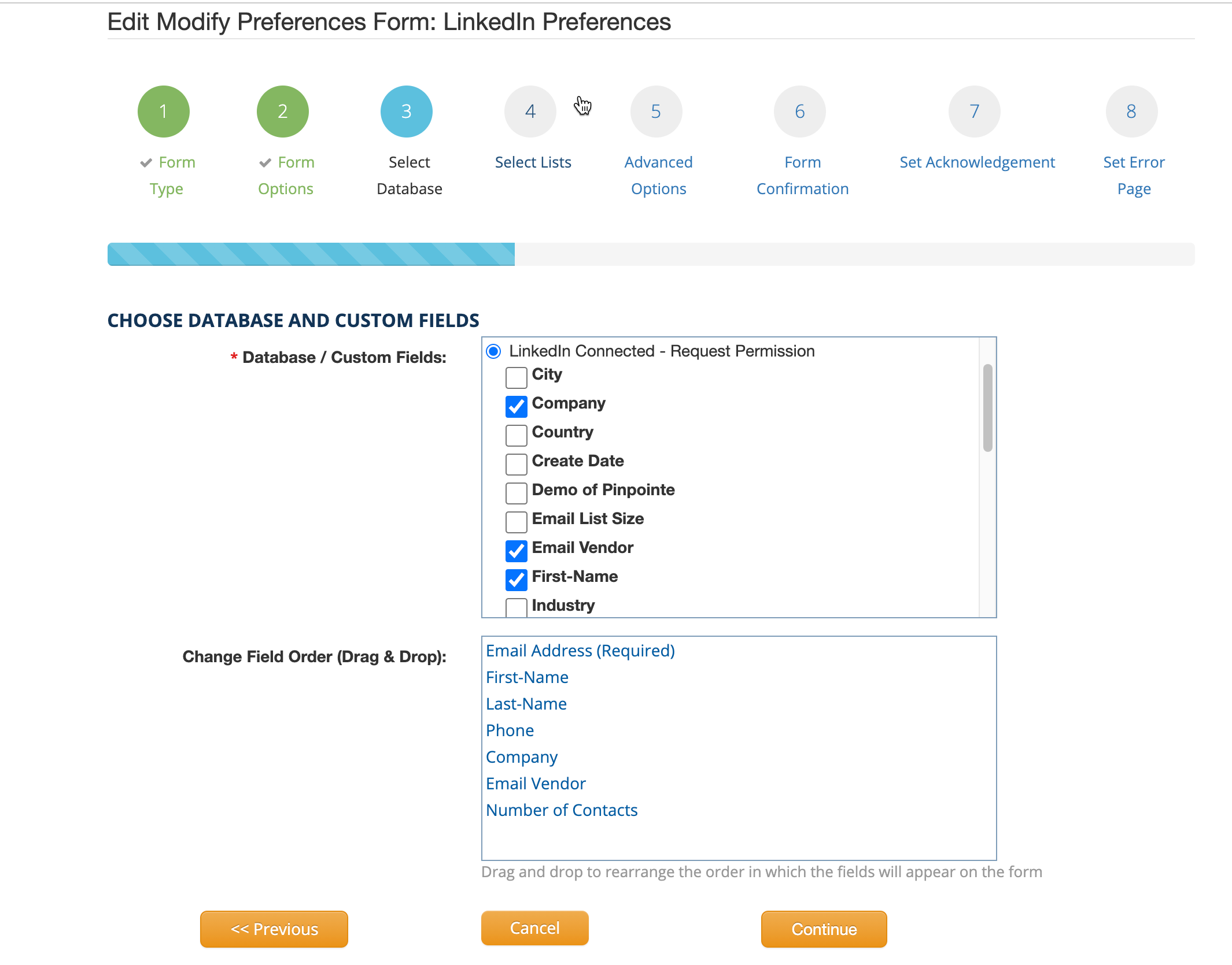
Whatever you decide to do, Pinpointe makes adding an opt-in form to your website pretty easy. Just log into your account and then click on the “Forms” link in the upper right-hand corner of the screen. Click “Create a website form” and you’ll see something like this:
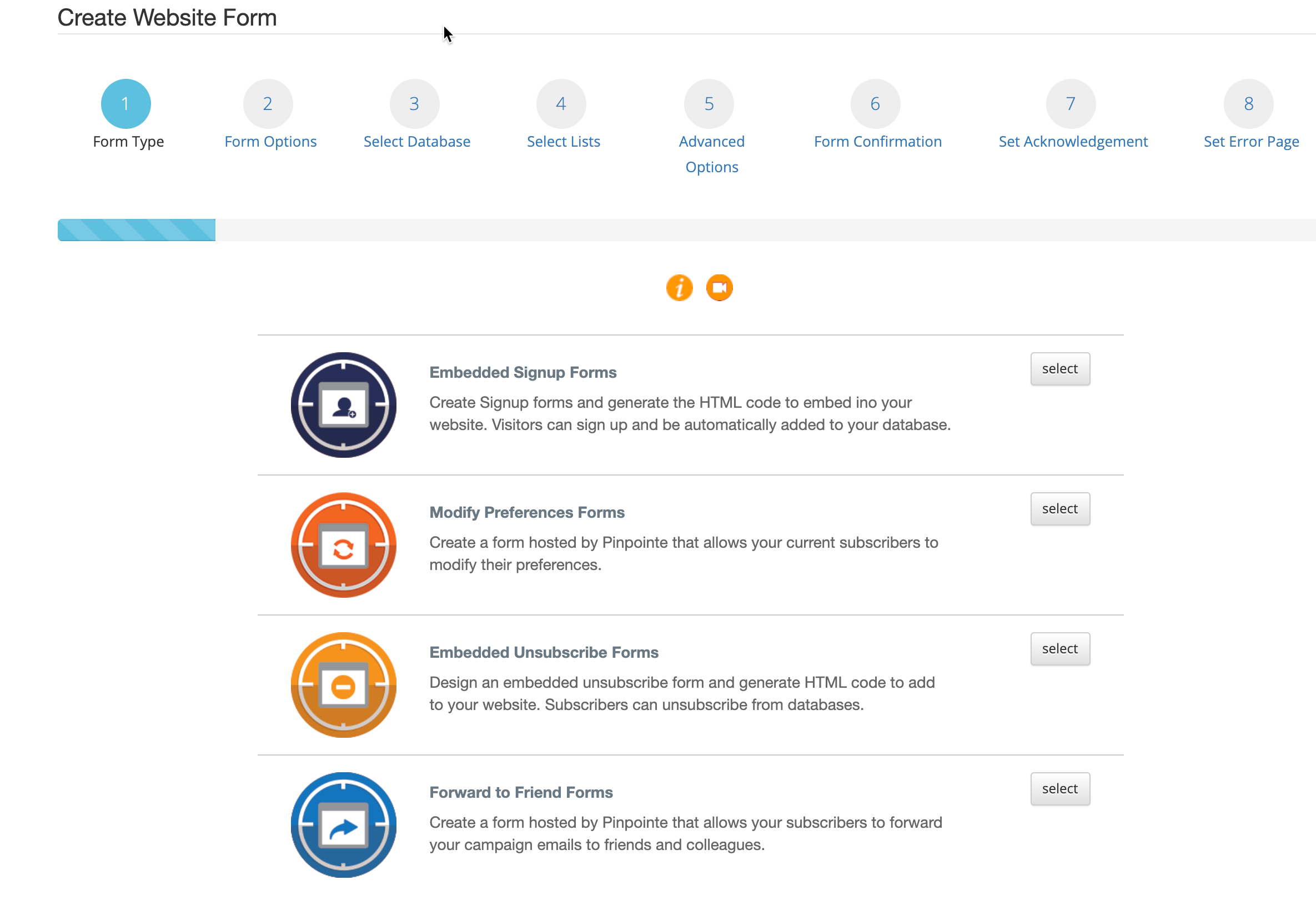
To add fields to your opt-in form in addition to the required email address, just check the checkboxes in the “* Contact Lists/Custom Fields” panel (where the arrow points to). You can add fields like first name, last name, zip code and more. You can also add a select to the opt-in form so people can choose different lists. So if you had, say, a B2C version of your emails, and a B2B version of your emails, you could add that option to your opt-in form.
For this example, we’ll keep the opt-in form pretty simple. We added first and last name in addition to the email field.
You’ll see this on the next page:
Click the orange “Preview Form” button to see the form, like this:
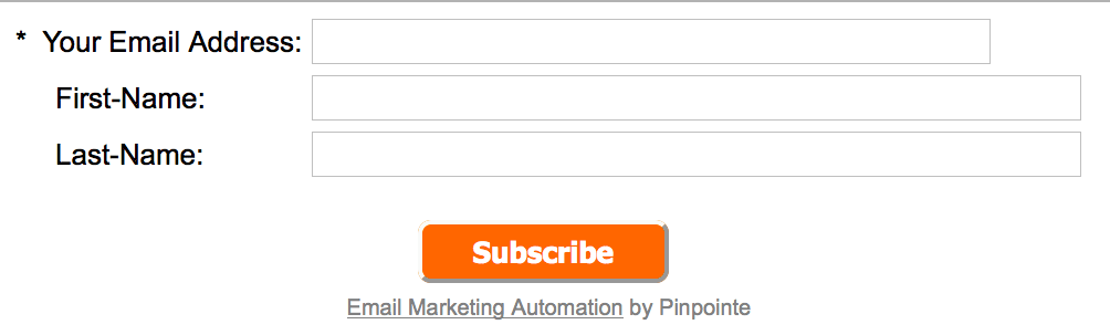
Looks good. We’ll go back to the form edit page and click “Next”.
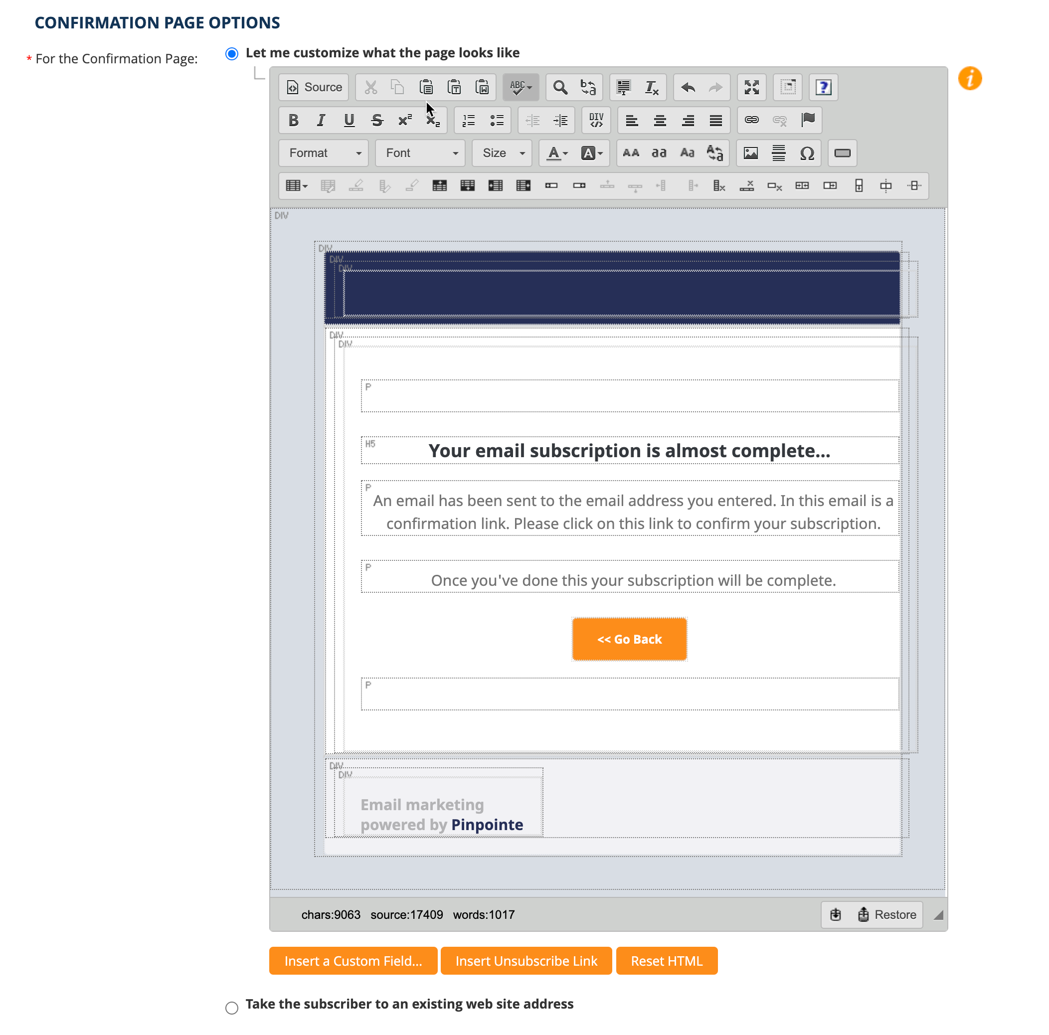
Now you’ll see the page where you can define what you want people to see after they’ve filled out the opt-in form. That includes the first confirmation message on the screen, then the confirmation email (We suggest using double opt-in, of course) and then the final confirmation email.
3) Don’t hide the opt-in form
Your poor site visitors. They just want to sign up for your email list. They like your company and want to keep tabs on it. Email is their preferred channel, not social media.
So they go to your site but see no opt-in form. There’s nothing in the header about it. Nothing in the footer. They go the blog, but there’s no opt-in form there either. Not in the right-hand column, not at the close of your blog posts. So they go to your About Us page… with no luck. And so they give up.
Yet you say you have an email list.
Really? Why are you hiding it?
4) Use a feature box for your opt-in form
This is one of the big kahunas for boosting email opt-ins. Yes, you are putting it on the most valuable real estate of your site: On the home page, above the scroll line, across the entire screen.
But do it, and do it right, and you’ll get half or more of your subscribers from that one opt-in box.
Here’s an example of a feature box that’s also an online assessment. Offering assessments can be a great way to increase people’s interest. New subscribers will get customized information (‘cause they know they’re special), and you’ll have valuable segmentation information. Assessment information can also be helpful to sales staff when they reach out for a follow-up.

This is the feature box of a digital consultant’s home page. She’s skipped the opt-in form because she’s offering an assessment. Another example of a feature box is the GoldCo home page screenshot from item #1.
5) Use a form, not a link
Here’s an example. Do this:

Not this:
 When clients from opt-in links (like the one above) to an opt-in form (like the example below it) we usually see a 20-50% increase in opt-in rate.
Why does this happen? People are resistant to clicking through. Having the form right there makes sign up look easier. And so they sign up more often.
6) Tell them what to expect
Your opt-in copy, while short, has an important job to do. You have to tell people what to expect. How often will you send them emails? What kinds of content formats will be in those emails (Articles? Case studies? Coloring pages?) Who are your emails designed for (CEOs? Students? One person marketing departments?)
All this influences how many signs up you get, but more importantly, it influences who signs up for your list. The end goal here is not a massive, bloated list of people who aren’t your ideal clients. It’s to have a responsive, engaged audience of ideal subscribers.
RestoreHealth does a good job of this on their email opt-in page:
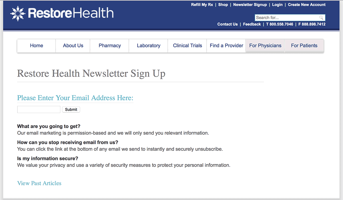 Notice that link at the bottom: “View Past Articles”.
7) Say something more enticing than “subscribe” on the opt-in form button
“Subscribe” is pretty boring. Given how extremely valuable the real estate on that button is, let’s try to write something a little more enticing. Even something as mellow as “Sign me up” or “Send me the report” is better.
Of course, you’ll have to test.
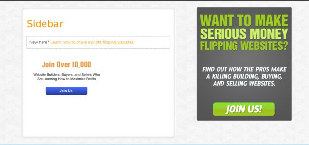
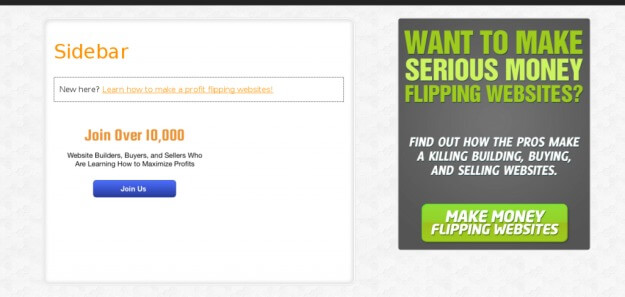
Empire Flippers did a test of their button copy of “Join Us!” versus copy that matched the opt-in’s headline… and got a 33.1% lift.
Here’s the original opt-in box:
Here’s the treatment:
Button copy is a great component to test. Of course, there are some more powerful things to test first, like the opt-in incentive, the form’s placement, or the opt-in headline.
8) Offer a sample newsletter, or let them view past issues
RestoreHealth (from #6) has a link at the bottom of their opt-in page for “View Past Articles.” This is not an essential element of an opt-in form, but sometimes it helps. It’s basically the principle of “try before you buy.” Some people like to see what they’re getting before they sign up. Let them read your amazing newsletters before signing up.
9) Call your updates something more interesting than “newsletter”
The word “newsletter” has associations with being out of date and tedious. It’s a word that’s about as appealing as broccoli (our apologies to broccoli).
So don’t use it. Call your email updates “updates”. Or maybe have a name for your email updates, like they were, you know, a publication. Maybe call your newsletter “The Buzz” if you sell coffee products. Or “The Tip” if you’re in the restaurant business.
Choosing a name for your updates might be the most fun you’ll have brainstorming in a meeting. Or you could outsource the name-picking job to your social media following and run a contest.
While it’s great to come up with a spicy name, it seems like the best word to use instead of “newsletter” is “updates.” That’s what Copyblogger, CrazyEgg, and many other sites (that test A LOT) tend to favor.
You could also reframe how people think about your newsletter. Copywriter Joanna Wiebe has taken this to the next level. She refers to her newsletter as “free help” and has gone so far as offering like it was a paid ebook, but for $0.
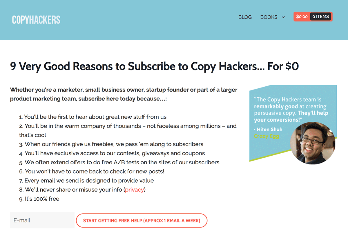 Notice that testimonial over on the right, too. They never hurt.
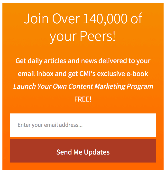
10) Use social proof
This works for a lot of sites. Whether you say how many subscribers you have, or how many followers you have, it’s all good. Don’t be afraid to include what feels like a small number, either. If you’re in a niche business, saying you’ve got 3,000 subscribers on the opt-in form might still be enough to trigger the social proof benefit.
Here’s the opt-in box the Content Marketing Institute uses on their blog. They believe in social proof enough to make it their headline.
Also notice how:
- The opt-in button is written (“me” versus “you”)
- The opt-in copy tells you how often you’ll be getting the updates
- The gray text in the opt-in field prompting you for your email address
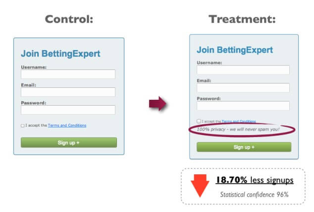
11) Add a privacy statement
Just be careful how you do it. Convent Verve has a terrific post about a series of a/b split tests they did on some privacy policy copy in an opt-in box.
Their first test actually reduced the opt-in rate:
Then they ran a few more tests, none of which produced a statistically valid result.
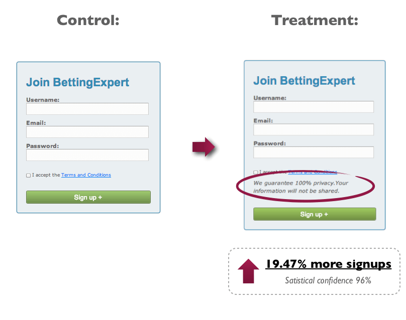
This was the test that finally produced a lift:
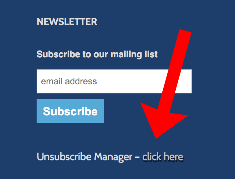
12) Add a link to unsubscribe.
This often works better than a privacy statement. Including the unsubscribe link so close to the opt-in form proves you actually do make it easy to unsubscribe.
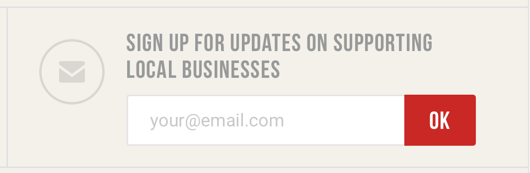
13) Put a default email address in the opt-in form
Prompt people to put their own email address into the form. It makes them just a wee bit more likely to take action.
Here’s how Google has the opt-in form for their “Get Your Business Online” website:
 This opt-in box also wins the prize for shortest button copy.
For such a small piece of screen space (unless you’ve got a feature box), that’s a lot of do’s and don’t for an opt-in box. Remember that web form best practices usually are the… um… best practice, that’s not always so. You’ve got to test, test, test.