You’ve worked hard on creating a captivating message for your email campaign. Now you need to compliment it with an engaging email design that looks professional and sends the right message about your company and the offer you’re promoting. By understanding the basics components of what goes into effective design, you will gain insight into what's involved in creating an attractive and effective email design that encourages positive action.
There are basic building blocks of every design composition, whether it’s for an ad or an email.
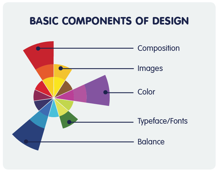
Some key components include:
- Composition
- Typeface (Fonts)
- Images
- Color
- Balance
Each design component by itself evokes various emotions, yet together they create a greater message to the viewer. Keep this in mind when choosing the different elements for your design, as they will affect the outcome and the whole look and feel of your design.
Below are a few email design guidelines to follow.
Composition
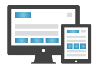
One of the first elements to consider is the shape and size of your design. In email marketing design, it’s best to keep your emails no more than 550-600 pixels wide. This ensures that the majority of your subscribers will be able to see your email as intended.
The height of your email design will be determined by how much content you have. However, it’s important to know that many recipients scan their emails in an email preview pane before they decide if they want to open it. A standard preview pane is around 300-400 pixels high, so make sure to include any important pieces of your email in this area – including a prominent call to action.
Learn more about the proper anatomy of marketing email design.
 Typefaces can be categorized by 'display types' (a heading or copy used for the brief introduction to the main copy) and 'text types' (main copy). The main difference between the two is the size. For an email, 'display types' should be about 22 pixels and 'text types' should be about 14 pixels. These sizes provide decent readability on both mobile phones and desktops.
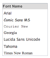
You also want to consider the font you use in your email. Most email marketing service providers offer about seven different font options. Choose a font that visually fits your message. For an example, don’t use Comic Sans for a business email that is going to executives. Comic Sans is better suited for an email being sent from a daycare or toy store. A safe font to use is Arial, as it is easy to read and fits most designs.
One last note – NEVER use more than two different fonts in your design and always ensure that your font faces are consistent throughout your email design.
Images
Your images should reinforce and clarify your message, but be used sparingly. Most email clients block images, so your design should not rely on images and should be able to stand alone without them.
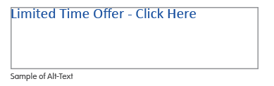
 Since most your email messages will first be seen without your image(s), always provide descriptive alt-text when setting up your email design. This ensures the reader will at least have some idea of the image you are trying to portray. In addition, avoid background images layered with text, as numerous email clients do not support background images.
In addition, avoid stock images that look like clip art. They present an unprofessional appearance and can downgrade the perception of your brand. Also avoid background images layered with text, as many email clients do not support background images.
Find affordable images for your email designs.
Balance
A good design should show balance between its different elements and create a sense of harmony that visually attracts the recipient. Using a grid approach can help you create this sense of balance, as it acts like a guide for positioning text and images and gives your design order. The number of units within your grid is determined by the complexity of the elements included in your email design. Effective email design is typically fairly simple and should only require the use of a simple grid.
Color
In all forms of non-verbal communication, color is the most instantaneous method of conveying a message. There's actually a whole area of science dedicated to the psychology of color that has proven different color schemes appeal more to one type of audience than they do to another.
Color affects human behavior and stimulates all of the senses, so there is no better place to gauge the effectiveness of color than in an email design – where it is vital to communicate a motivating, positive and enticing message.
Learn more about the meaning of different colors and how they effect your email design.
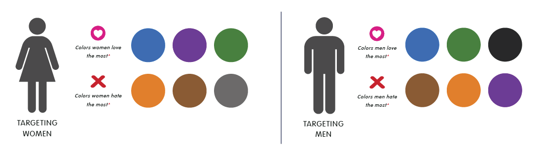
Source: https://blog.kissmetrics.com/how-colors-affect-conversions/
Color Selection Process:
-
Define the message.
Is it serene, bold, powerful, sensual, etc.? - Define what it should suggest.
- Select dominate colors that convey the message.
- Choose supporting colors that reinforce the massage.
- Check competitors’ colors for similarities.
- Utilize engaging color combinations.
We hope you now have a better understanding of the core graphic elements that go into designing an effective email design. We encourage you to push yourself and try new design ideas that utilize the principals we discussed in this article.
Good luck and happy designing!
NEED HELP WITH YOUR EMAIL DESIGN?
Pinpointe can help! We have a design team that can transform your email campaigns into attention-getting communication.
Learn how you can a customized campaign email template.