Our recent webinar, 27 Design and Content Tips for Creating Clickable Email Campaigns, covered 27 ways to build effective emails. At the end, there were many questions that we could not cover in the allotted time span. As a follow up, here are the answers to those questions along with 9 more email design and content tips that you can put to work right away.
1. How Many Call-to-Actions Should I Have?
Call-to-Actions (CTAs) come in many forms: buttons, social sharing icons, hyperlinks, surveys, and even simple questions the email may ask the reader. These are all the different types of call-to-actions you may see in an email.


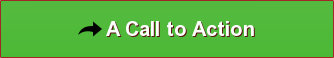

THIS IS ALSO A CALL-TO-ACTION.
Call-to-Actions intersect design and content; some CTAs are buttons and some are simple plain-text hyperlinks. Other email CTAs, such as those that come from a sales representative, may be non-linked directions. An example of this is when a sales representative asks a prospect to call him or her.
Call-to-actions are important. However, you don’t want to overload your subscribers with too many CTAs, and you definitely don’t want to overload them with too many actionable options.
B2B brand research by Millward Brown shows that Microsoft is the top B2B global brand. Below is an example of how Microsoft designs and implements CTAs in one of their email campaigns:

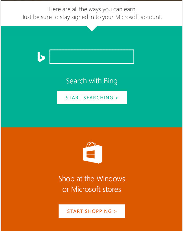
That’s a lot of CTAs. However, the email works: it’s pleasing to the eye, designed in a simple column that will look great on a mobile device, and each call-to-action belongs to one content block. More importantly, the primary CTA – a link to the Microsoft Rewards page – is placed above the fold.
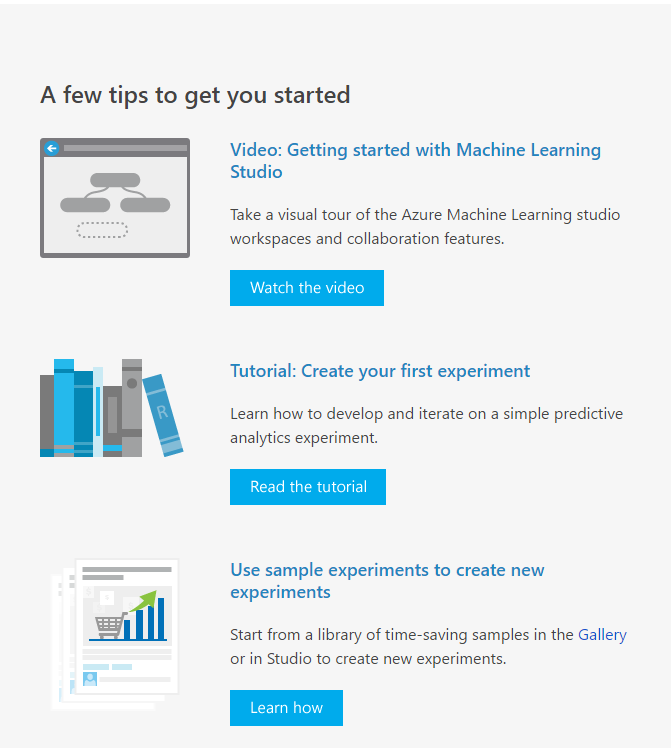
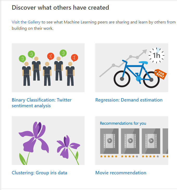
The next series of Microsoft emails are much different, mostly because they go to different customers with different needs and user experience expectations from their emails.

But nothing is more different than the Microsoft Azure newsletter.
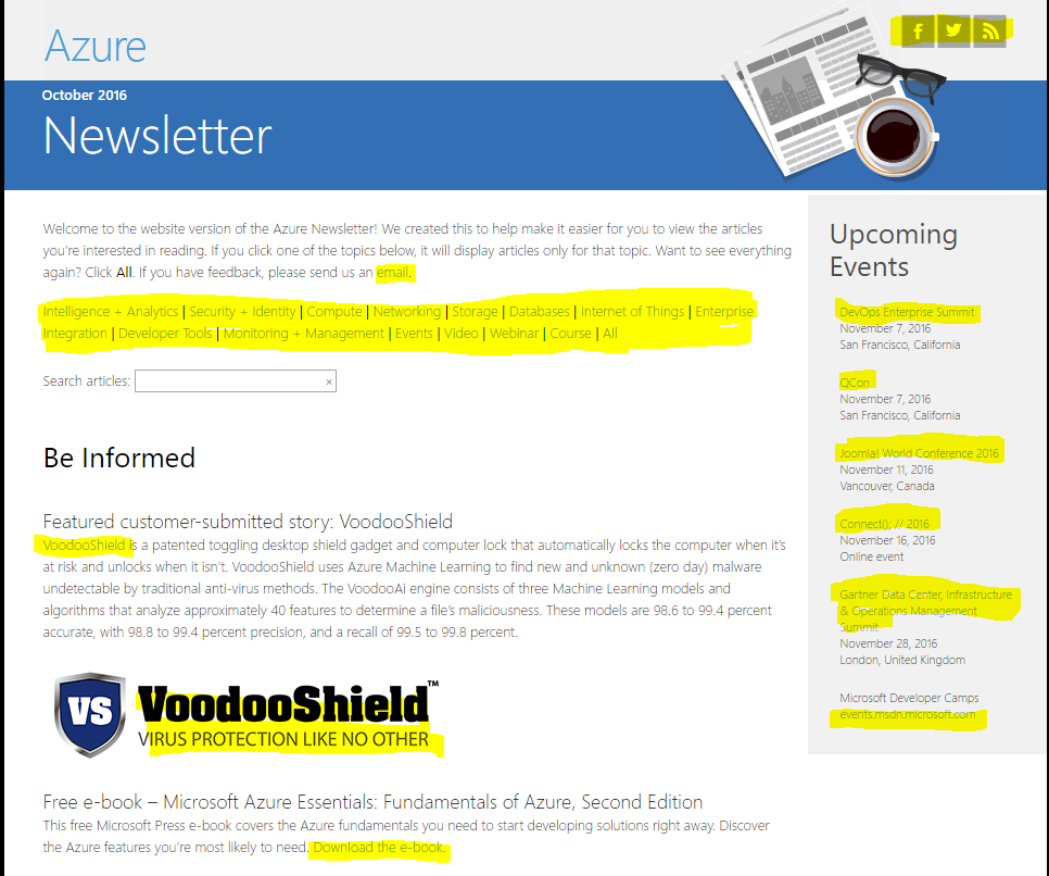
All of the highlighted content are links which are essentially CTAs. The text is small and the background doesn’t stand out much from the light blue hyperlinks. The Azure Newsletter, which is designed to be read in its entirety in an email client, is an example of CTA clutter.
However, email design and content structure is not a black-and-white discussion. Campaigns need to be evaluated in the context of who will consume the inbox content.
The primary readers of the Azure Newsletter are IT managers, data scientists, and web application developers. Maybe this demographic wants a newsletter with multiple links because it’s a more streamlined way to stay on top of managing the Azure infrastructure. The primary readers of the Microsoft Reward emails are more a more diverse crowd: gamers, workers who using Office 365, project managers, students, and more.
Top performing email marketing campaigns make an effort to understand their customers and conduct multiple rounds of split testing until the top performing email emerges.
Now, let’s look at what not to do with email CTAs.
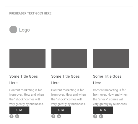
The call-to-actions are stacked very close together: an image, a button, and social sharing icons. This is an example of the kind of CTA clutter that isn’t pleasing to the eye and is overwhelming to readers. This design style, which isn’t all that uncommon, looks especially confusing on mobile devices.
Key Takeaway: Call-to-Actions are meant to be visible, bold, and easy to interact with. But too many in one email washes away the effectiveness. There is a diminishing return with each extra CTA. Spend time designing high-converting action sequences rather than peppering your emails with too many buttons, links, and images. It’s good user experience and puts the focus on the importance of the action.
2. Where Should You Put Your Social Share Icons?
Social icon placement touches on bigger design challenges, namely the experience of the user and content hierarchy.
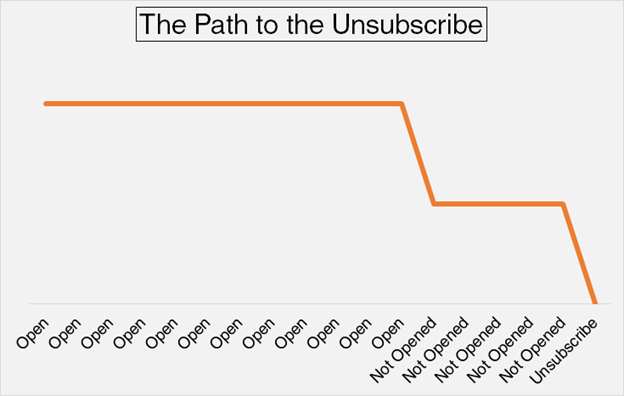
The biggest predictor of opening an email is recency. Clients who opened past emails are likely to open future emails. That is, until they open a few emails in a row that are irrelevant, boring, or something they consider to be SPAM.
If social sharing icons make sense for your users and are important to your campaign, put them above the fold. However, if you’re trying to use email to increase social sharing, you run the risk of making an email instantly irrelevant. This begins the path to the dreaded unsubscribe.
When writing and designing emails, do what journalists do: they put the most important information at the top and the least important information at the bottom. That’s effective content hierarchy in a nutshell.
3. What is the Typical Size of a Preview Frame?
A standard preview pane for those viewing an email on a desktop is around 300-400 pixels high, so make sure to include any important pieces of your email in this area – including a prominent call to action.
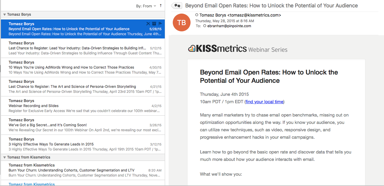
Below is a sample of how an email previews in a preview pane in Outlook 2016.
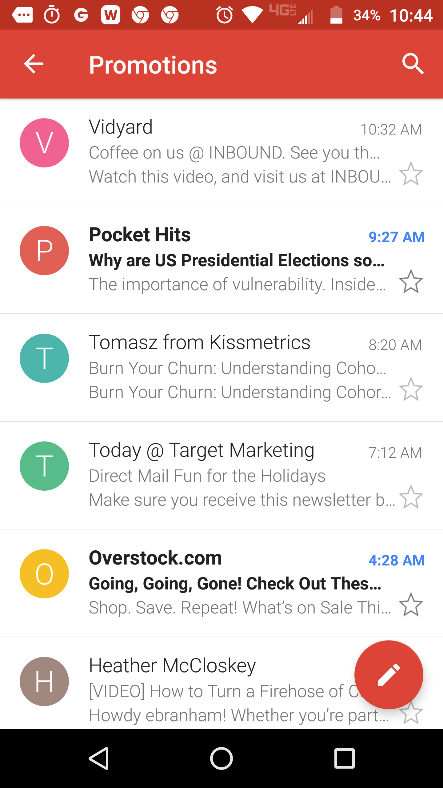
When viewing your email on a mobile phone, you don't get the benefit of a preview pane. You only see who the email is from, the subject line and the pre-header text, so make sure you use all three to your advantage.
4. In a Campaign Length of Two Months, How Often Would You Send out an Email? Would You Ever Send the Same Email Twice in One Campaign?
Marketing Sherpa conducted a large survey that asked email recipients how frequently they would like to see an email in their inbox from a particular brand
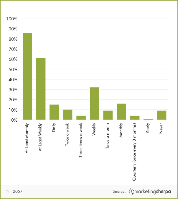
From this data we can see that the clear frequency winners are weekly and “At Least Monthly.” The clear losers are “Daily,” “Twice a Week,” “Three Times a Week,” and “Yearly.” This gives you some options as to how to structure your email campaign frequency. Over the course of two months, you could send out as few as two emails (one each month) or eight (one email per week, four weeks). This frequency would, on average, be well received by your customers.
However, even the most accurate surveys only capture a point in time, making them unreliable in the long-run. When structuring your campaign frequency, ask yourself the following questions:
- What Campaign Frequency Worked in the Past?
- If You Are Making a Change, Why Do You Expect it to Work Better?
- Can you A/B Test Your Campaign Frequency?
Whenever you find yourself asking “What if” or “Should I?” the best answer can be found through A/B testing. You can view the Pinpointe Split Testing Webinar for more information on how to split test your campaign assets from subject line to landing page. Split testing takes all the guess work out of figuring out your campaign strategy by allowing your email recipients to tell you what they want, and what they like best, from your campaigns.
5. How is Mobile First Impacting Email Marketing?
Multiple data sources confirm the same trend: half of your emails will be opened on mobile devices. When you are designing your emails, you’ll want to be aware of how the email will look on a variety of devices, screen sizes, and clients on both the desktop / laptop and mobile views.
6. What Color Palettes Are Best?
There are many color choices available. This is both a blessing and a curse. Choosing the correct colors for the correct email starts with having a strong understanding of how color impacts the user experience. In peer reviewed studies, choosing the correct color choices drastically increases conversions. There are multiple color palette tools available that give you the chance to experiment with many options.
This is an example of a palette that is perfect for a summertime newsletter.
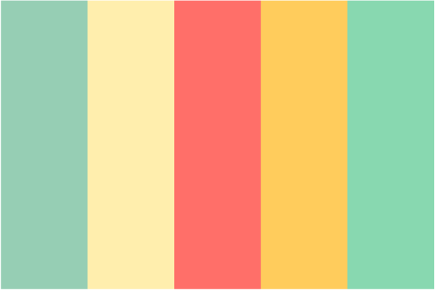
However, it’s complex palette that requires some experimentation and consideration as to what color belongs to which sections of your email body content.
This palette is simpler, where the grey is the body background, the black is the text, and the different blue tones can be used for buttons or headlines.
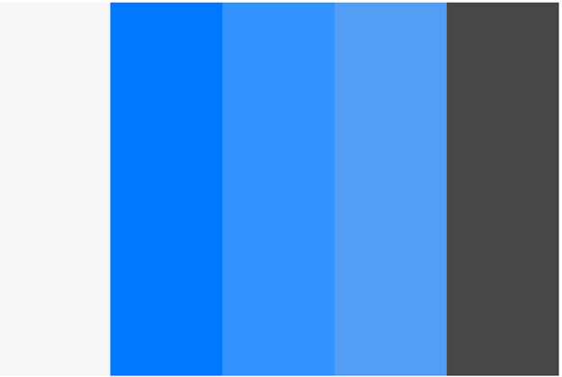
There’s a lot of design functionality in picking a single color and choosing different tonal variations for different inbox elements.
7. Is Designing Above the Fold Relevant Considering the Amount of Screen Space Available?
If you ask two different email marketers about placing an emphasis on designing above the fold, you’ll get two different answers.
The “Yes!” Camp: Designing above the fold is crucial because emails are previewed prior to being read. Use the fold to immediately emphasize the benefits and features of your email.
The “No!” Camp: There is no reason to place a call-to-action or other important element above the fold. Email subscribers have come to accept that scrolling to read content is part of the email experience. Use the fold to to give a preview for what comes next in the email.
The common theme among these two different design camps is that the fold is important. That hasn’t changed since the first newspaper was printed. However, what you choose to place above the fold may have changed. Users know email is a scrolling experience. But that doesn’t mean you should give up valuable space either. As with all things email, experiment, test, and conquer.
8. How Frequently Should You Change Your Subject Lines?
Subject lines are the first contact point recipients have with your email. Relevant and engaging subject lines can increase open rates, giving your emails a high likelihood of being clicked. A good rule of thumb is to change the subject line of an email when you change the body content of the email. However, having A/B testing in your arsenal allows you to experiment further than conventional email rules.
For example, you could develop two emails (A and B), give them each a different subject line, and send both out to half of your subscriber base. You could then repeat that experiment by giving A and B the same subject line but with different body content. This gives you two different options to choose from.
9. Should I Use Plain-Text or HTML for My Emails?
Like most things, the answer is: “It all depends.”
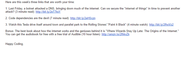
Plain text emails are great for conveying personalization. Recent data suggests that recipients want image based HTML emails yet, when metrics are analyzed, actually prefer plain text emails. This is a sample plain text newsletter. The text is easy to read and the links are clickable.
What surveys don’t tell us is the interpretation people have of plain text versus HTML. This email is not plain text, but it isn’t quite HTML or image heavy.
Again, A/B testing is your friend. You can create three variations of the same email (plain text, HTML/image light, and HTML/image heavy), send them to 50% of your subscribers at once, and let them tell you what they like best.
Email Design and Content Tips
There are endless possibilities when it comes to design and content strategies for email. In fact, as you were reading through these 9 tips, you may of had even more questions relating to design and content strategy. Check out our email design and content strategies webinar replay on to find out tested and conversion ready email marketing methods.